One of my favorite anti-spam plugins is CleanTalk. I use it on most of my personal and client sites, and I literally get zero spam, without needing captchas or other complicated setups.
It just works right out of the box. However, one area that I think has a lot of room for improvement is the plugin’s interface in the admin dashboard. So, I decided to explore some ideas on how it could be improved.
Before diving in, I want to emphasize that this is purely a personal exploration for my own UI/UX satisfaction. I am not hired or commissioned by CleanTalk. If anyone from their team happens to see this, feel free to draw inspiration—I’d be honored to see some of these ideas make it into the product’s UI.
Overview of existing UI
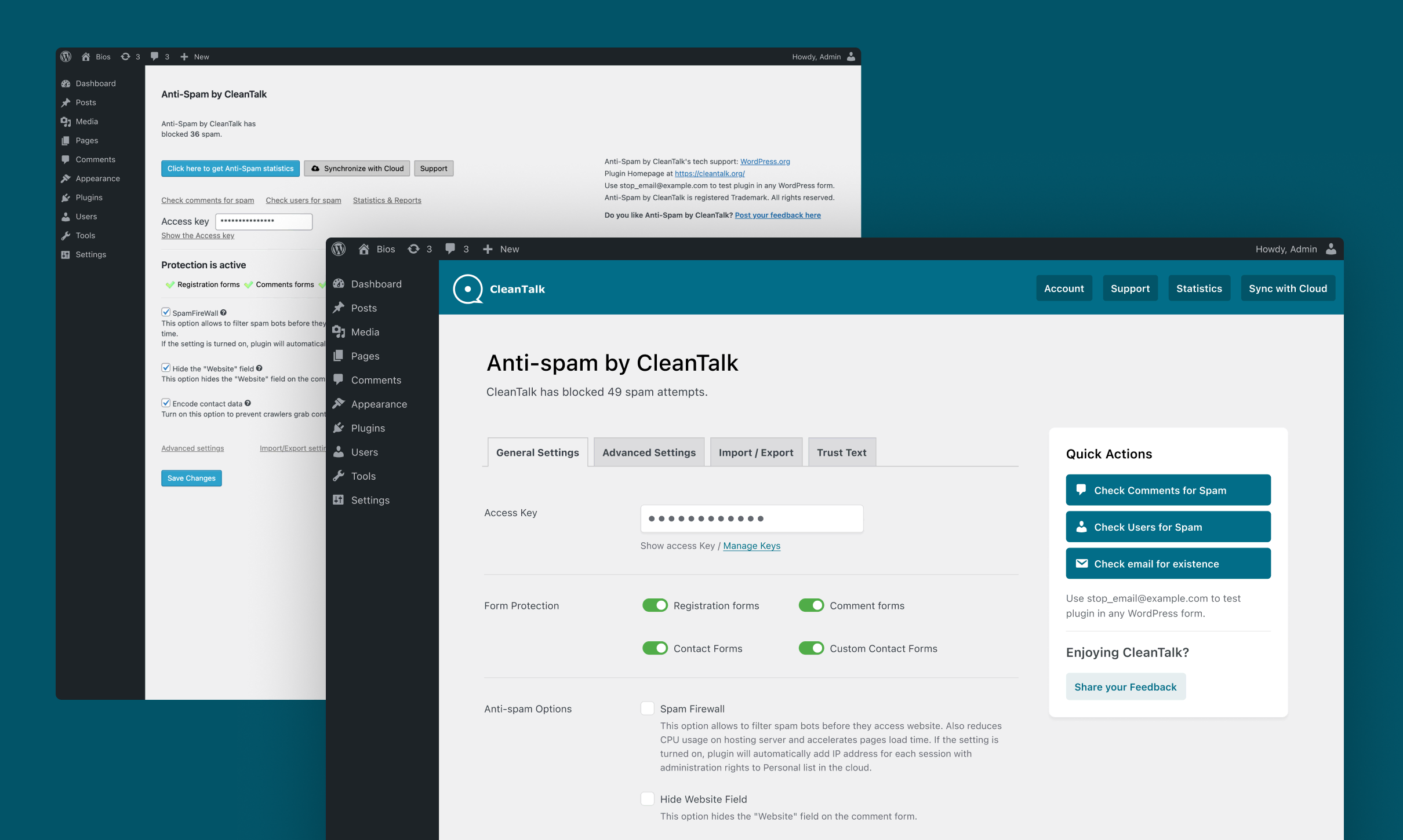
Once again, CleanTalk works like magic. BUT, there are a few issues with the current settings page in my opinion:
- The current layout lacks a clear visual hierarchy. There’s a lot of functionality, but it isn’t presented in a structured, easy-to-navigate way.
- The advanced settings are hidden away at the bottom as a simple text link, along with other important settings that deserve more visibility.
- Many anti-spam actions/checks exist, but they aren’t obvious at first glance. These checks could really benefit from better visual grouping.

Suggestions
After a couple of hours in Figma, I came up with a rough mockup and some ideas:
- Improve the visual hierarchy and polish the UI while maintaining that native WordPress look and feel.
- Add a top bar with a bit of branding, where key buttons (and potentially other elements) could be housed.
- Reorganize the settings into tabs to provide a more structured, intuitive navigation experience.
- Group all actionable anti-spam checks into a sidebar panel for easier access.
- Use toggles for form protection options, allowing users to enable or disable each one more seamlessly.

Wrapping up
I hope you enjoyed this quick post. CleanTalk is amazing, and I feel the plugin’s settings page should reflect the high quality of its functionality. Of course, this is just a quick exploratory brainstorming, and there’s still a lot of work and research needed for a full redesign.
Designing settings pages for WordPress plugins is all about balancing functionality, usability, and aesthetics. With the upcoming WordPress admin UI overhaul, I’m excited about the potential for a more standardized and intuitive experience across all plugins, making it easier for users to manage their settings.
Until then, let’s work with what we’ve got!
If you have a WordPress plugin that could benefit from a UI/UX revamp or consulting, don’t hesitate to get in touch!
